

Background
Variable is a language learning application that allows users to shape their journey by offering a customizable curriculum and goal based approach. Variable aims to offer a credible & flexible learning journey for curious but already engaged users. I created the app from concept to high-fidelity prototypes through conducting research, sketches, and rounds of design iterations. I conducted many rounds of user testing and altered the design based on various feedback to improve the apps readability and usability.
Problem
How might we offer diverse learning methods for users in anticipation of constant changes and pace of their busy lifestyle.
Challenge
It quickly became clear from my research that having a platform in which the users could choose their method of learning and set their own user preferences/goals were very important. Making sure that the user’s able to choose their own learning experience became the real challenge.
Empathize
I chose to focus on user interviews and usability testing; both in person and remote to ensure certainty that all prototypes were non-confusing and appreciated by the intended user base. I worked using market research, user research, and user testing/evaluation during all iterations of the product’s development helping create a working viable product.
Secondary Research
One of the most important steps in development was diving into primary and secondary research to best understand the language education market as well as adult learning. The University of Wisconsin Adult learning principles were listed as best when;
1. Understanding why adults need to learn something
2. Adults have the freedom to learn in their own way
3. Learning is experiential or hands-on
4. The time is right for them to learn
5. The process is positive and encouraging.
Primary Research
To back up my secondary research I interviewed a total of 6 participants, ranging from 21-58 years in age, all employed full time with a motivation and curiosity toward learning language in their spare time. After asking about their previous learning experiences, insight was given about their feelings and emotions associated with understanding new languages through other platforms.

Joel wanted to “Compete against friends, but had no way to talk with others. There were articles that were in english but none in the taught language”. This was consistent with my secondary research and led us to offer multiple offerings for users such as peer to peer tutoring, reviewing old lessons, podcasts, and other resources. This sentiment confirmed that users enjoy practicing/learning language through multiple techniques because not all users learn the same way.

Liuba was frustrated by the amount of notifications received; ‘They (notifications) got to be too much, to the point where I became overwhelmed using the application and just deleted it.’ I found participants tend to set reminders to continue using learning applications. Without a reminder many users forgot to continue learning and lost their motivational ‘learning streak’.
Some users like Liuba also reported the opposite, annoyed by too many reminders causing them to eventually stop using the application. This led us to focus on offering custom notification settings to ensure the user feels in control of their journey and not suffocated.
Define
Affinity Maps
After my research, I used affinity maps to synthesize my interview data and restructure it into insights.
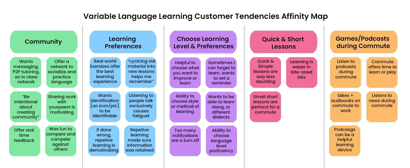
Through the exercise, I saw patterns within user interaction and preferences. I created some user quotes generated from my research to best fit my maps;
“As a daily commuter I need a reminder to learn or else I will be too busy bustling around throughout the day to check in”
“As a freelancer working from home, I want to be fully understand the application, so I can set goals to feel motivated and accomplished when completing lessons.
“As a visual learner I need alternate methods of teaching, or more materials that I can practice with in my spare time or with others”
Developing the potential user through these quotes helped categorize data into 3 focused categories of interaction; Onboarding, Settings, and Teaching methods.
I did not dive too deeply into a community interaction because I wanted to focus upon the user first before building out a network/community.
Persona
I created a single persona to help exemplify the user- their pain points, motivations, scenario and goals to help strengthen my understanding of end-users. This persona became Commuting Cindy, a younger full time professional who has bits of free time and an interest to learn a new language in-between. Cindy became the main representation of our customer base; someone who has time and interest to check into their smartphones daily- not enough time for intensive learning, but enough to learn through goal based motivation.

How Might We’s
After having a well-defined target user I mapped out user journeys to help identify what features the customer base would want offered within my learning application, coming up with two How Might We statements:
How might we motivate the user to learn daily without overwhelming them?
How might we offer an individualized/personalized curriculum?
Ideate
Continuing to return to my user research and personas I began to develop user stories based on features that users would want to use when learning via Variable. I then mapped those stories using sticky notes so that everything could be reorganized easily, digitizing aspects of my notes for easier viewing. After arranging and looking at my notes, I was able to understand what the user’s minimum viable product would be.
MVP
Offer users the ability to custom set reminders to learn.
Allow users to know and choose what is being taught
Help users practice language outside of learning exercises.
Offer varied lessons times depending on the user
Site Map
While sketching different iterations, I mapped out the first version of the site map to make sure the MVP’s were met. My goal was for users to start from a home page, using the dashboard like ‘Home’ page to branch into either the ‘Lessons’, ‘Community’ learning, or user ‘Settings’ where any preferences can be altered.
Simplifying this process for the user should eliminate any confusion and distractions, allowing them to jump into their learning immediately- with varied options.

User Flows
I mapped out the most critical user flows identified from my user stories. The first flow (far left) showcases the Sign In/Up process that eventually would lead to the user dashboard. When looking at the sign up flow it became clear the initial sign up process showed to be more complex than anticipated, making it clear that having a simple yet efficient sign up process was key.

The second user flow (right) covered all branches of the learning dashboard. This included the Lessons, Community, and Help pages, quickly dividing content pages into 3 main pages below the home ‘dashboard’. Now that I knew how to organize my content, I started sketching out designs that would seamlessly connect everything together.
Sketches
I created a red route wireframe screen prototype from my initial sketches to represent the general application layout and show the user progression from signing up to starting a lesson, below are all the hand drawn screens laid out in order.

I made a very simple working prototype from these sketches and approached potential users from my screener for some quick feedback. The general flow was easy for users to understand, but many questioned the purpose of the 'Daily Goal’ and the ‘Starting Level’ pages. This showed me that not all pages were not being fully understood by users, and thus required further explanation for a seamless experience.

Both of these pages offered no context toward what the user was interacting with. One user asked “what if I don’t want to set a goal” and then later mentioned they felt confused not knowing what the goal was being used for. In addition, the words ‘Starting Level’ doesn’t not properly inform the user that a placement test is upcoming on the next page. To fix these issues some clarification and better explanation of education levels were needed.
Style Guide
I chose to use light blue colors for modals, purples for explanations, mixed with warmer brighter colors for pieces of information or connecting with others. I chose the color green for CTA buttons and progress buttons, ending with the use of red for buttons that disable features or warning areas.
In addition to color I picked out two easy to read complimentary typefaces- Nunito for the paragraph type, and Raleway with its geometric display face for the header. I did not want the user to be too distracted, or feel too serious reading type that looks like news font versus a fun book or cool information tidbits.

High fidelity
Design Challenge - 01
During my first usability testing I tried out different interaction sequences with users- which quickly revealed that users still did not understand context within all pages, so I added introduction screens before actions pages to make sure their was less confusion. I also simplified settings pages like within notifications, I chose to eliminate a cluster of checkboxes and replace them with sliding modals to visually simplify the sign-up process.

Design Challenge - 02
After the first batch of usability testing I decided to concentrate on fine tuning and making sure that all design-standards were upheld. Remote moderated and unmoderated testing uncovered some issues with maintaining visual standards in my design. The current CTA buttons as well were not well explained or following my style guide standards; some buttons were longer than others, others offered descriptions while some did not, lastly a couple buttons were confusing because of similar color choice. This was all extremely helpful to identifying issues that needed to be changed.

During a remote unmoderated test a user named Maman continued to express confusion at distinguishing one dashboard page from a learning page. I did not expect this confusion but it made complete sense and caused me to dig through my prototype to make sure standards were upheld on all pages. Maman also expressed confusion that the colors and descriptions of the current buttons were not clear enough to understand. I kept the green button associated with learning, but changed the similar yellow button colors (Connect, Review) since they were offering two different CTA’s.
Testing
I made a ‘final’ prototype with high-fidelity interfaces and conducted multiple rounds of user testing. A link for my prototype can be found here- https://miloselchaif207347.invisionapp.com/console/share/4K2NWJ8LDQ/656780215
Conclusion
Reflecting on this entire project I realize it was a very ambitious project for many reasons, and once I realized this I decided to concentrate on creating specific user settings rather than the entire UI. Many users who tested out the prototypes expressed a lot of pleasure in being able to choose how often they received reminders and the ability to reference past material. For this to be better understood I think various content would need to be tested with users. Because my main aim was to focus on alternative methods of learning, testing of such learning would be needed to make sure these methods would be of functional use.
This was a very interesting project for me, helping me quickly realize creating a learning application means to cater to many different methods of education; how individuals learn, practice, teach, and interact with others/material. Being able to tackle an educational concept and realize the need to concentrate on specific bits of my prototype was very eye opening. If I am unable to create a cohesive educational app, as shown by early testing- users are quick to stop learning. Once I later focused on making sure all content was concise, users were much more apprehensive about Variable as a prospective product. It seems like the correct pain points were chosen to be improved, and if continued, many expressed interest in using this platform to learn a language!
Suggestions
Future iterations would hopefully have a few more features and corrections;
A fully fledged forum for questions and threads
Peer to peer resources for either extra curricular practice or native help with any foreign language questions
Add in mixed media (podcasts, videos, songs, movies) to encourage exploring new cultures
Connecting strangers via the forum or an invite network
Offer longer length lessons, some users expressed a want to immerse themselves for longer periods of time
Some kind of rewards, many users during testing loved the badges that DuoLingo awarded upon completion
Offer to text daily reminders instead of push/email